

Seasoned yarn addicts know that warmer weather does not mean that it is time to put up the crochet hooks. What it really means is that with the arrival of a new season, there are all sorts of fresh sources of inspiration: lively floral blooms, wispy cirrus clouds, picnics and road trips. These beloved spring
Seasoned yarn addicts know that warmer weather does not mean that it is time to put up the crochet hooks. What it really means is that with the arrival of a new season, there are all sorts of fresh sources of inspiration: lively floral blooms, wispy cirrus clouds, picnics and road trips. These beloved spring elements can transform into chic color schemes and innovative projects.
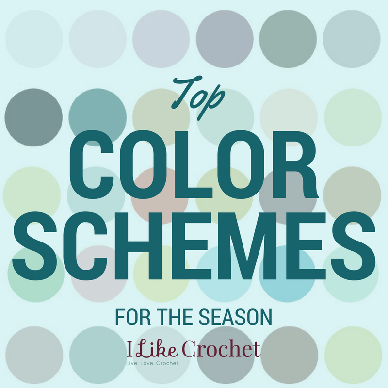
Although the classic pastels of spring are irresistible, there are plenty of other options if you want to adventure out into new territory. To help plant the seeds for a productive season of crochet, we have collected our favorite color palettes and yarns. Plus, these selections all come from this issue, so you have all the necessities to start your spring design book right here.
Spring Color Schemes
Flower Power Goes Purple

Some of the best flowers of the season are purple—lilac, lavender, and violet, just to name a few. Each shade of purple seems to have its own personality, too, from the soothing feeling of the lighter hues to the royal tones of the darker ones. Yet these variations of purple also work incredibly well together, especially with a few darker greys and slate colors added in for contrast.
Fairy Tale Forest
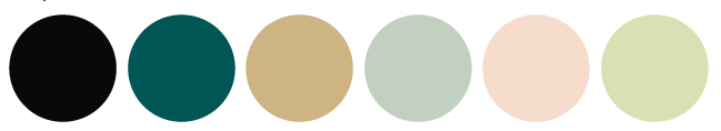
For a mysterious color scheme that still has an element of nature, go for darker colors accented with gold or champagne shine. Think of the color of the sky when a spring rain is on its way or the cool shadows under a weeping willow—this is the vibe you can capture with a fairy tale color scheme.
Pastel Throwback
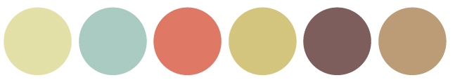
These sand and beige colors are soft like pastels but have a nice retro edge from their faded, sepia tones. Throw in a few pops of color like blue or rose, and you will be transported back in time.
This Palette is for the Birds
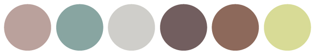
What would spring be without bird calls and chirps? Not as much fun, that’s what. These rich browns, leafy greens, and soft blues capture the spirit of our feathered friends for a color palette that truly embodies spring’s warmth and calmness.
Easter Classics

Of course, it wouldn’t be right to leave out the bright blues, pinks, and yellows of Easter eggs against a soft background of green grass. This color scheme just shouts with springtime joy, and your wardrobe or home décor can always use a pop of this excitement.

I really like the color schemes you have for spring 2018.